
Bronze Foldaway Washing Lines: Built for Face Brick and Warm-Toned Homes
Ask most South Africans what colour a washing line comes in and they will say white. Push a little and they might get to black. Almost nobody says bronze.
Which is a shame, because bronze solves a problem that a very large number of South African homes have. Face brick.

What bronze actually looks like
Bronze is not chocolate brown and it is not gold. It is a deep, warm brown with a metallic depth to it, the same finish you see on bronze aluminium window frames, bronze garage doors and bronze burglar bars on thousands of homes built from the 1980s onwards.
That is not a coincidence. South African aluminium frames are supplied in a standard palette of white, bronze, charcoal and natural anodised silver. Bronze was the default warm option for decades, and it is having a genuine comeback in newer builds alongside champagne and warm metallic tones.
So, if the frames around your windows and sliding doors are brown, chances are they are bronze, and you already know which washing line to order.

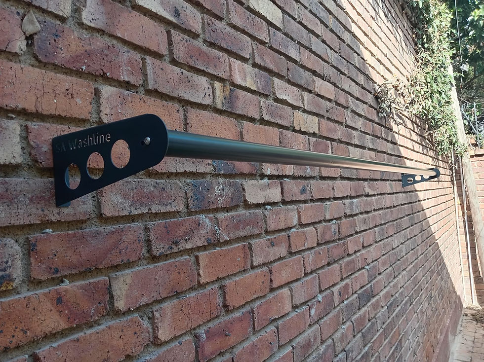
Why bronze beats white on face brick
Face brick is a warm, mid-to-dark, heavily textured surface. Red, plum, roan, firelight, whatever your brick is called, it carries a lot of visual weight.
Put a white line on it and you have created a bright object against a dark busy background. It is the first thing anyone sees. Put a bronze line on it and the line sits in the same tonal family as the wall. Your eye reads brick, then garden, then eventually the washing line.
Charcoal does something different again. It frames the brick, like a dark window frame. Both work. Bronze is the softer, warmer of the two, and it is the better choice if the rest of your house leans warm.

Where bronze belongs
Red, brown and plum face brick walls, including the travertine and satin finishes used across South African housing estates.
Bronze aluminium window and door frames, bronze garage doors and bronze burglar bars.
Terracotta and clay roof tiles, which sit in the same warm family.
Tuscan and Mediterranean style homes with beige, ochre or sand plaster and arched openings, still one of the most common looks in Gauteng.
Wooden decks, pergolas, carports and cladding, especially oiled or stained rather than painted wood.
Sandstone, travertine and natural stone cladding.
Thatch roofs, lapas and bushveld or lodge-style homes, where bronze reads as an earthy, deliberate choice.
Homes with brown paving, clay pavers or terracotta tiled patios.

Where bronze shines
Bronze truly shines when paired with natural materials and warm-toned exteriors. Its strength is in its ability to complement, rather than contrast with, the built environment.
Facebrick Walls: This is the classic match for a bronze washline. The warm, earthy tones of facebrick are beautifully complemented by the rich, slightly darker hue of bronze. The result is a cohesive, integrated look where the washing line feels like a natural part of the home's structure.
Warm-Toned Plastered Walls: If your home is painted in warm colours like beige, sand, terracotta, or any other earthy tone, a bronze line is your best choice. It will complement the warmth of the paint rather than creating a harsh contrast.
Traditional and Rustic Settings: Bronze is a natural fit for homes with a more traditional, rustic, or country-style aesthetic. It pairs seamlessly with timber features, stonework, and lush gardens, adding to the overall charm.
Outdoor Living Spaces: For those who see their garden and patio as an extension of their living space, bronze adds a touch of sophistication that feels grounded and connected to nature.

Where to think twice
Bronze is warm, and warm sits badly next to cool. A few situations to watch.
Cool grey homes. Grey plaster, grey face brick, white walls with charcoal detailing. Bronze on a cool grey palette looks like it came off a different building. Charcoal is the finish you want there.
Charcoal window frames. If your frames are charcoal and you put up bronze, the two browns and greys sit in the same eyeline and neither looks right. Match the frames.
Stark modern minimalism. If your house is white boxes, glass and black steel, bronze will feel out of period.
Bright white indoor sculleries. Bronze reads heavier than white indoors. It can look lovely in a farmhouse-style laundry with wooden shelving and brass taps, but in a plain white scullery, white or charcoal is the easier call.
The Tuscan test
Here is a shortcut that works surprisingly well. Stand in your garden and count the warm surfaces. Brick, terracotta, timber, sandstone, ochre plaster, clay pavers, thatch. Then count the cool ones. Grey plaster, charcoal roof, grey pavers, black steel, white walls.
If warm wins, order bronze. If cool wins, order charcoal. If it is genuinely close, charcoal is the safer default because it behaves like a shadow rather than a colour.
Bronze is not a dated choice
Bronze frames were everywhere in the eighties and nineties, and for a while afterwards everything went white, then grey, then charcoal. Some people now hear bronze and picture a tired 1994 face brick townhouse.
That has shifted. Warm metallics are back in South African aluminium ranges alongside champagne and bronze tones, and warm earthy palettes are running through the paint forecasts too. More to the point, the millions of face brick homes in this country did not change colour. If your house is warm, bronze is not nostalgia, it is just the correct answer.

A note on heat and dust
Bronze is a dark finish, so like charcoal it absorbs more heat than white and will feel warmer to the touch on a west-facing wall in midsummer. On the plus side, it hides dust far better than white does, so you will wipe it down less often. Warm soapy water and a soft cloth is all it ever needs.
Send us a photo
If you are staring at a face brick wall wondering whether bronze or charcoal is the one, take a photo from where you normally stand, wide enough to include the window frames and the paving, and WhatsApp it to us. There is no wrong choice here, but there is usually a better one.
Bronze foldaway: quick match guide
What is on your house | Verdict | Why |
Red or brown face brick | Strong match | Same warm tonal family, the line settles into the wall |
Bronze aluminium frames | Strong match | Matches the frames, gutters and burglar bars already there |
Terracotta or clay roof tiles | Strong match | Warm on warm, reads as one palette |
Warm beige or ochre plaster | Strong match | Classic Tuscan and Mediterranean pairing |
Wooden deck, pergola or cladding | Strong match | Picks up the brown in stained or oiled timber |
Sandstone or travertine cladding | Strong match | Natural stone and bronze share the same earthiness |
Thatch, lapa or lodge style | Strong match | Earthy and deliberate rather than industrial |
White aluminium frames | Works, with care | Fine on warm walls, odd if white dominates |
Charcoal roof or grey pavers | Works, with care | Only if the walls themselves are warm |
Grey plaster or grey face brick | Not its best wall | Warm bronze against cool grey looks unplanned |
Charcoal aluminium frames | Not its best wall | Two competing darks in the same eyeline |
Bronze Foldaway Washing line: Colour-match Chart

Foldaway Colour Comparison Table
Finish on your house | White | Charcoal | Bronze |
Red or brown face brick | No | Yes | Yes |
Grey face brick | Care | Yes | No |
Cream or white plaster | Yes | Yes | Care |
Warm beige or ochre plaster | Yes | Yes | Yes |
Grey or charcoal plaster | Care | Yes | No |
Sandstone or travertine | Yes | Yes | Yes |
Timber deck or cladding | Care | Yes | Yes |
Thatch or lapa | Care | Yes | Yes |
White aluminium frames | Yes | Yes | Care |
Charcoal aluminium frames | Care | Yes | No |
Bronze aluminium frames | No | Care | Yes |
Terracotta roof tiles | Care | Care | Yes |
Charcoal roof or grey pavers | Care | Yes | Care |
Indoor scullery or laundry | Yes | Care | Care |


Comments